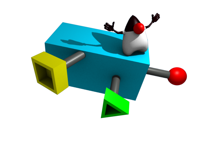
Several improvements to the logo:
- more abstract connectors removing any association with plungers
- smoothed shapes so it also looks good in large size
- better colors, nice primary colors just like Duke
- more unobscured Duke image (connector is moved to the side)
- lengthed the shape of the component so it suggests movement a bit more
- more logical lighting position (coming from behind the camera)

